Quick Tip: Simple Sparklines with 'AtF Spark' (Sparks) by After the Flood
Sparklines are very small (line/bar) charts that often appear in line with the actual text. For example, the progression from 1 to 10 could be portrayed as 1{2,3,4,5,6,7,8,9}10 without breaking the line. They are regularly featured in economics publications and especially articles dealing with stock prices. Also, they can be used in Microsoft Excel as an in cell alternative to full-scale graphs.
Sparklines do not only look very nice, but also tremendously help with getting across statistics and data that otherwise just would not be visualized.
So far, using them on the web or in a regular text processor was fairly complicated and usually involved some custom code.
Fortunately, After the Flood, a data visualization and analysis company based in Lodon, just released a free font (AtF Spark) that allows you to add sparklines very easily.
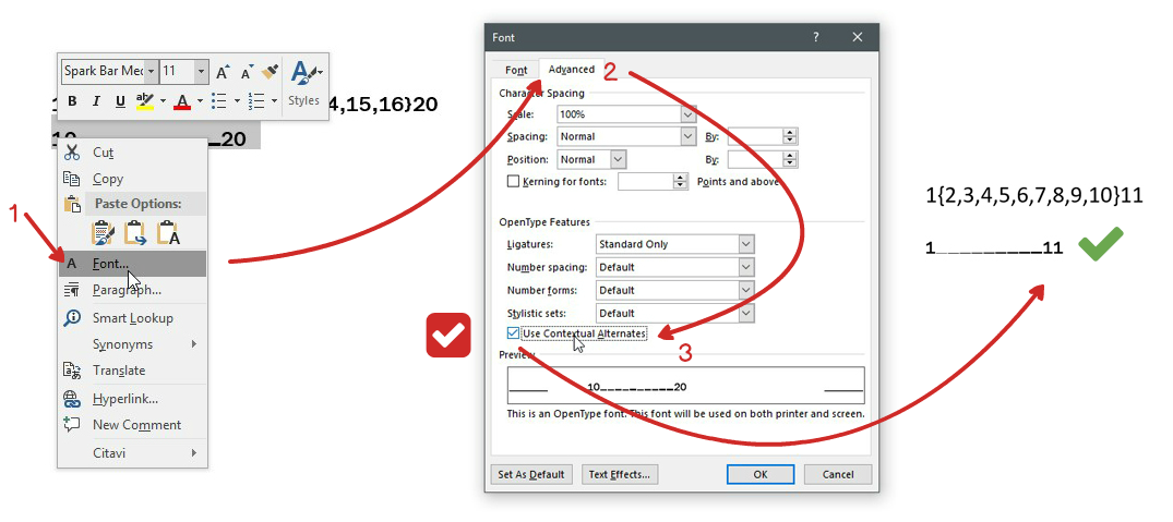
After installing the fonts, we simply have to note down our data in a special syntax (start{x1,x2,x3,x4,x5}end - 10{20,30,40,50,60,70,80,90}100) and change the font to one of the AtF Spark ones.
There are not just various fonts for dot-lines (1{2,3,4,5,6,7,8,9}10), but also bar charts (). All in all, they are all very fun to play with!
Best of all, “Spark is free to use and modify” and can be found on After the Flood’s GitHub.
‘AtF Spark’ (and Sparks 2.0) in Microsoft Word
Since the font utilized OpenType Contextual Alternates, we need to make some adjustments if we want to use AtF Spark in Microsoft Office.
Update: AtF Spark becomes Sparks
In early 2018, After the Flood renamed the font into Sparks and released Sparks 2.0, a much more robust and extended version. Make sure to have a look at the new version and all the cool stuff they’ve added!

Thank you for visiting!
I hope, you are enjoying the article! I'd love to get in touch! 😀
Follow me on LinkedIn