Quick Tip: Converting a Likert Scale to a Stacked Horizontal Barchart in R
Recently, I had my students grade various statements and hypotheses on a likert-type scale. This process, intended to activate previous knowledge and to get a reasonable baseline, will be repeated towards the end of term.
The survey looked something like this:
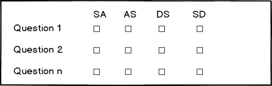
They had to judge the individual questions/statements on a scale from “Strongly Agree” to “Strongly Disagree”. Ultimately, I wanted to present the results as a stacked barchart that indicates the distributions for each statement.
Unfortunately, my otherwise great audience response system (ARSnova) doesn’t provide very good export options. Hence, I ended up with clearly untidy data (see Wickham 2014).
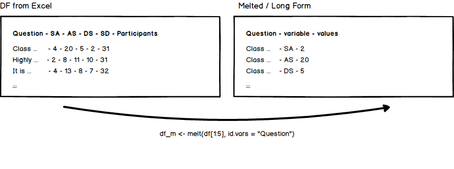
As you can see above (left hand side), there are various issues with the data. There are multiple columns for the same variable (agreement) and some of the information is doubled (the Participants columns is just the sum of the previous values).
Luckily, this is not really an issue in R and after some minor melting, the data is in a much more reasonable format. Well, R comes equipped with some pretty amazing data munging tools (see, e.g., this article by Jan Gorecki).
The Code
library(ggplot2)
library(ggthemes)
library(reshape)
library(xlread)

df <- readxl::read_xlsx('18-statements-session-1.xlsx')

df["SA"] <- df["SA"] / df["Participants"] * 100
df["AS"] <- (df["AS"] / df["Participants"]) * 100
df["DS"] <- df["DS"] / df["Participants"] * 100
df["SD"] <- df["SD"] / df["Participants"] * 100

df_m <- melt(df[1:5], id.vars = "Question")

ggplot(df_m, aes(x = paste(substr(Question, 1, 50), '...') , y = value, fill = variable)) +
    geom_bar(stat = 'identity') +
    ggtitle('18 Statements / Session 1 (Total)') +
    xlab('Statement') +
    ylab('Participants') +
    coord_flip() +
    theme_minimal()
After reading in the data from an Excel-sheet, I’m leveraging the Participants columns to normalize the data. In the following I’m simply melting the data (easy as pie if you have reshape available) into the aforementioned much more reasonable format. As you can see, I’ve excluded the Participants column (by slicing) during the melting process since it just isn’t needed. Afterwards, ggplot2 does all the heavy lifting. Simply adding the coord_flip geom will create a horizontal chart.
The Result
Having done all of this, I’ve ended up with something like this.
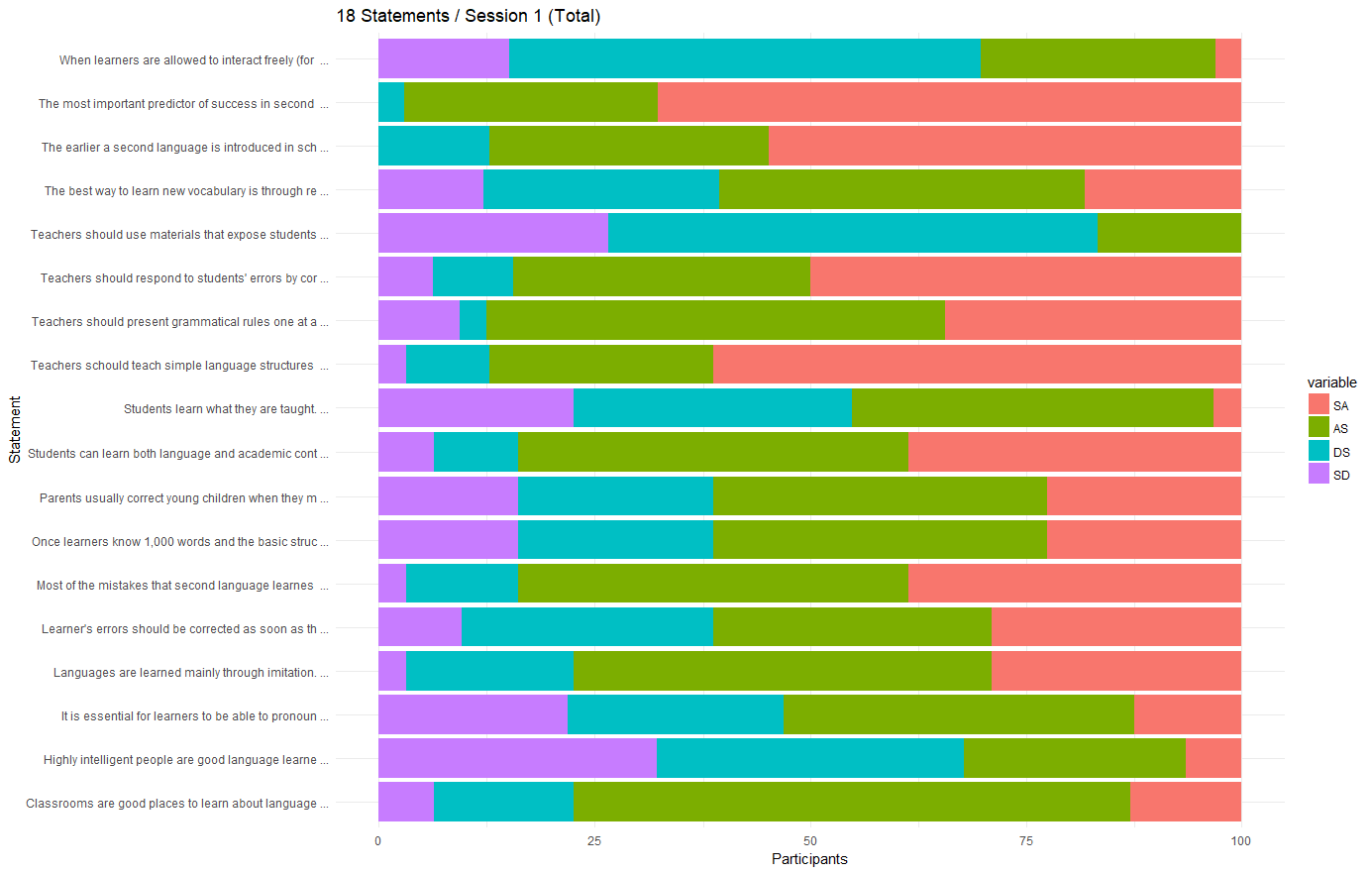
While one could argue about the (rather unpleasant) color-scheme and whether you want SA to be on the left or on the right (basically a matter of sorting the data before plugging it into ggplot2), this seems like a very reasonable visualization for multiple, contextually linked, likert-type scales.
References
Wickham, Hadley. “Tidy Data.” Journal of Statistical Software 59, no. 10 (2014).

Thank you for visiting!
I hope, you are enjoying the article! I'd love to get in touch! 😀
Follow me on LinkedIn